5 Curtain Colors to Avoid in Your Living Room Design
When choosing the perfect color scheme for your living room, many focus on the big-ticket items—the sofa, walls, and rug. However, the humble curtains are often overlooked and relegated to an afterthought in the design process. It's crucial to consider your curtain color, as it can make or break the room's overall aesthetic. In this article, we'll explore the top 5 curtain colors to avoid in your living room, according to interior designers.
Red
The red curtains provide feelings of comfort and sometimes wistfulness, whether at Christmas, a B&B, a hotel, or even a luxurious, enchanting plain. However, the good old wooden doors and window shutters are better off in traditional, dominant houses. Indeed, red curtains can turn the room into a kind of time machine that takes one back to the world of old.
White
White is one of the most flexible and trendless colors adaptable in any room. Alternatively, they used it as a curtain color, and in that regard, it may look rather formal and unwelcoming. This is truer if warmer neutrals are somewhere else within the room to relay the chilling effect of a white shade.
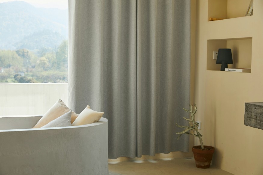
Dark Blue
Dark colors surrounding windows can make a room feel darker and more somber. This is because they absorb light instead of reflecting it, creating a sense of gloominess. If you're set on using a dark color curtain, opt for a sheer material like linen that allows some light to filter through. Make sure to hang the curtains to the floor and ensure they don't obstruct the window.
The Same Color as the Walls
While matching your curtains to your wall color might seem like a good idea, it's a mistake. Curtains add depth and interest to a room but do not blend seamlessly with the walls. Instead, opt for a tonal effect by choosing a color a few shades darker or lighter than your wall color.
Overly Patterned Curtains
A very good reason for using patterned curtains is that they bring out the level of ornamentation in the house. But then again, if not well monitored, they could reach levels that one couldn't handle. It is advisable to avoid using curtains patterned with crowded design themes or bright-colored curtains that will probably make the other part of the room blend in with the curtains.
Summing up, this paper has provided a guide on how to choose curtain colors for the living room and thus should serve as a helpful guide when selecting curtain colors for one's living room. If you can avoid the five colors that we have debated here and today - red, white, dark blue, curtains of the same color as the walls, and overpowering patterned curtains - you will be able to arrange a harmonious and inviting room that you would like to sit in. So, when choosing curtains for the living room, it is important to remember that curtains play a major part in the mood of your home. They may extend its dimensions, create more warmth and dimension, and be instrumental in tying out the entire theme in living spaces. Implementing this info for your benefit and following the tips and advice highlighted in this helpful article, it is very likely that you will have a nice-looking and ergonomic living room that you will cherish. When furnishing a room, people may want to make a space more personal or expand it with light: the right curtain color can significantly contribute to this.
Related Article : 10 Modern Dining Room Ideas To Elevate Your Gatherings


From Digital Models to 3D-Printed Homes: Jaspreet Kaur Lall Explains How the Innovation Changes the Construction Industry

Future Belongs to Green Construction: Sampath Kumar Paspunoori Explains One of the Key Trends in the Construction Industry

Kamala Harris' Campaign Ad Uses Iconic Visuals from Carrie Mae Weems to Connect with Voters

Historic Ancient Roman Ruins in Baalbek Remain Strong After Israeli Air Strikes; Locals Seek Cultural Protection

4 Ways to Honor Departed Loved Ones in Your Home Design


